identity design project
Designing a corporate identity is a fairly straightforward task, although the results can be widely varied.
This particular mark is for a subset of a large company based in Germany, ABB. The goal was to create a mark for their division that manufactures equipment to measure paper thickness.
Sound abstract? It was to an extent, but part of the design process is to clarify any loose ends in order to create an effective solution.
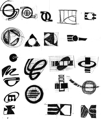
So research was the first step. It was important to find information that suggested something visually. I first began sketching the drum of a paper press, then rollers that flatten large sheets of paper as they are created.
The mark evolved to suggest precision and measurement with the varied line weights and prominent point.
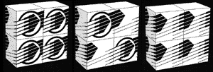
To test our marks, it was important to make sure that it was recognizable in motion, at a very small size, reversed, and distorted.

< back